
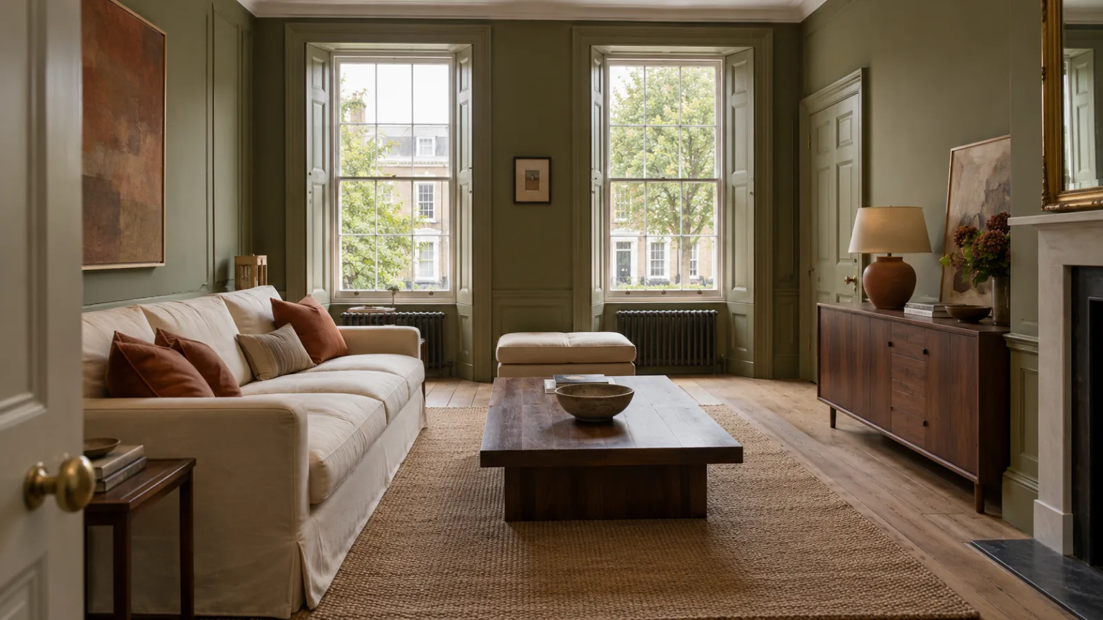
Good living room color schemes are rarely built on one perfect paint color. They're a small group of colors that repeat across the walls, sofa, floor, curtains and the odd ceramic on a shelf. And they still look right in the light your room actually gets.
The usual route to a warm room is beige, then another beige, until the walls, sofa and rug blur into one oatmeal shade. Warmth can come from olive, clay, rust, walnut brown, or even a muted blue sitting next to wood. The hard part is choosing colors that agree with each other and with your windows. That's mostly a matter of undertones and light, not taste.
If you only have time for two parts, start with undertones in section 3 and testing samples in section 8.
In this article
- 1. How to Choose a Color Scheme for a Living Room: Start With What Won't Change
- 2. Use the 60-30-10 Rule in a Living Room (Loosely)
- 3. Read the Undertone Before You Read the Name
- 4. Let Your Light Shift the Palette: North, South, East and West
- 5. Warm Living Room Colors That Aren't Beige
- 6. An Earthy Living Room Color Palette: Three Schemes to Try
- 7. Turn the Saturation Down, Not the Color
- 8. Test Paint Samples in the Room Before You Commit
- 9. Choose the Paint Finish Separately From the Color
- Final Thoughts
- Frequently Asked Questions
1. How to Choose a Color Scheme for a Living Room: Start With What Won't Change
Most people start at the paint store with a fan deck of a thousand colors. It's the hardest place to begin. Start with what's staying in the room.
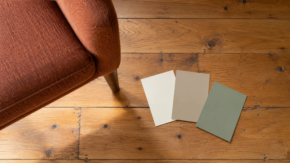
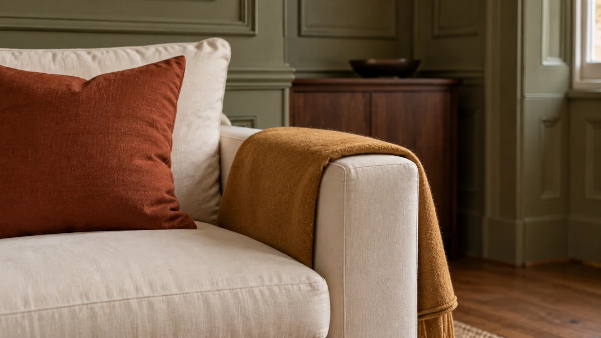
Look at the large, expensive or fixed things. That means the floor, the sofa, kitchen cabinets you can see from the living area, tiles, a brick or stone wall and big curtains. They already have colors, and the paint has to get along with them. A honey-toned oak floor carries plenty of yellow, so a slightly green or gray neutral on the walls will balance it better than a yellow-beige. A rust sofa already brings the warmth, so the walls can stay quiet and the accents can lean olive or brown instead of adding more orange.
Write those colors down, or photograph them in daylight and in the evening, and build the palette around them. If your starting point is a brown sofa, living room ideas with a brown sofa goes through pairings for each shade.
2. Use the 60-30-10 Rule in a Living Room (Loosely)
The 60-30-10 rule says roughly 60% of a room should be a dominant color, 30% a secondary color and 10% an accent (Behr). In a living room, that usually means the walls and ceiling as the 60, the sofa and larger furniture as the 30, and cushions, art and small objects as the 10.
It works because it stops every color competing at once. Treat it as a way to check balance, not something to measure. Nobody needs to work out the square footage of a cushion.
| Role | Rough share | Where it usually goes | Example |
|---|---|---|---|
| Dominant | About 60% | Walls, ceiling, large light surfaces | Warm ivory |
| Secondary | About 30% | Sofa, curtains, large furniture | Muted olive |
| Accent | About 10% | Cushions, art, ceramics, one chair | Rust |
| Natural tones | Alongside | Floors, wood, stone, rattan | Oak, walnut |
| Grounding dark | A little | Frames, lamp bases, a side table | Espresso, charcoal |
Wood and stone usually sit outside the count. They behave like neutrals that warm everything around them, which is why a wood floor makes a cooler palette easier to live with.
You can break the rule on purpose. A deep green feature wall can take far more than 10%, while rust appears only in a lamp and a frame. What matters more is repetition, not matching. If olive shows up in the sofa, a print and a planter, it ties the room together without everything turning the same green.
3. Read the Undertone Before You Read the Name
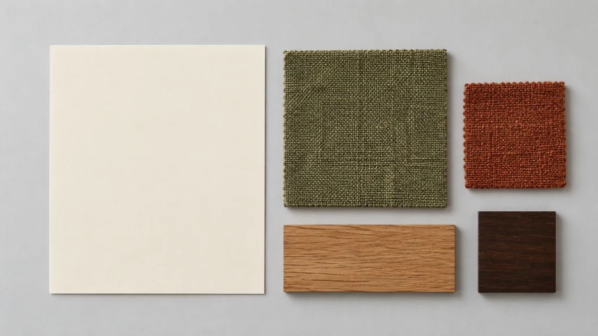
Two paint cards can look almost identical in the store and turn out completely different on the wall. The difference is usually the undertone, the hidden hue underneath the main color. It gets stronger as the painted area gets bigger.
Whites can lean yellow, pink, green, blue or gray. Benjamin Moore describes warm whites as carrying red, orange and yellow, and cool whites as hinting at green, blue and violet. Beiges lean pink, yellow, green or gray. Grays lean blue, green, violet or brown. Two paints both sold as "greige" can sit on opposite sides of warm.
Undertones matter most where colors meet. A blue-leaning gray beside a blue-gray sofa looks colder still. A brown-leaning greige beside oak and terracotta looks settled. The mistake to avoid is choosing three colors you like on their own, then discovering on the wall that a pink-leaning taupe clashes with a green-leaning sofa.
To spot an undertone, compare a color with others from the same family rather than looking at it alone. The cast shows up by contrast. Check the darkest shade on the same strip, where the undertone is usually easier to see. Hold the card against plain white paper. Then put it next to your floor and sofa, in daylight and again under your evening lamps.
4. Let Your Light Shift the Palette: North, South, East and West
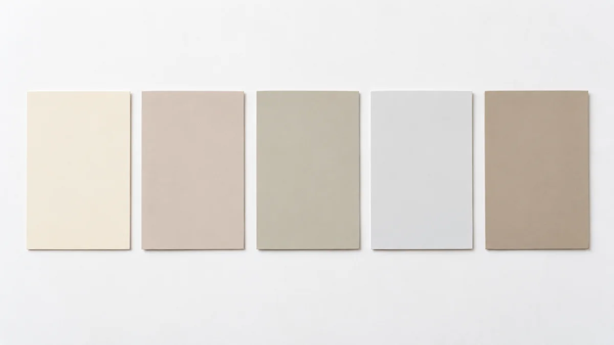
The same paint looks different from room to room, because natural light changes with the direction a window faces and the time of day. Benjamin Moore notes that both daylight and artificial light can push a paint's undertones warmer or cooler.
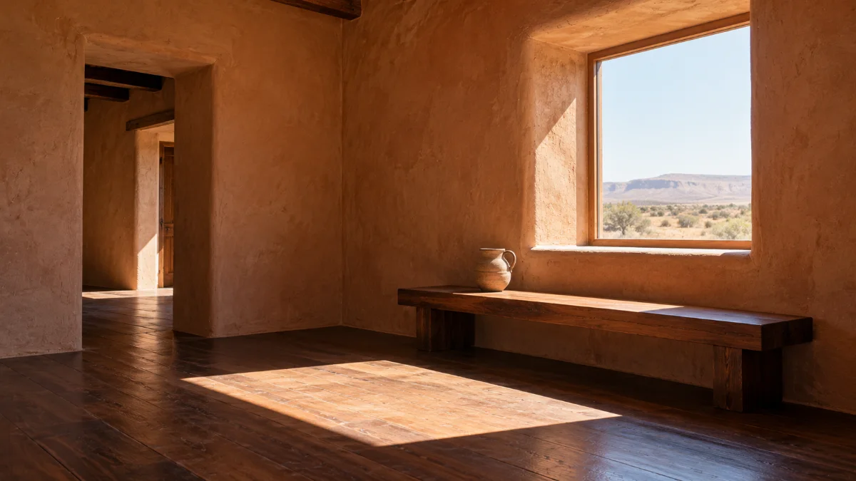
In the Northern Hemisphere, north-facing rooms generally get cooler, less direct daylight. Cool colors look colder, and many bright whites go dull and gray. Creamy whites, clay, warm greige, muted olive and dusty terracotta hold up better. Benjamin Moore's north-facing guide points toward soft yellow undertones to balance the coolness. Blue and green still work if you choose versions with some warmth or gray in them.
South-facing rooms generally get stronger, warmer direct light, so warm colors look warmer still and a yellow-beige can turn golden. Soft greens, muted blues and less-yellow whites balance it, and these rooms can usually carry deeper colors.
East-facing rooms are bright and warm in the morning, then cooler and flatter later. West-facing rooms are dim in the morning and golden in the afternoon, which is why cooler-leaning neutrals are often suggested to even out that amber light. Test any terracotta or ochre there at five o'clock, not at noon.
In the Southern Hemisphere, swap north and south. North-facing rooms get the warmer direct sun, and south-facing rooms get the cooler, less direct light.
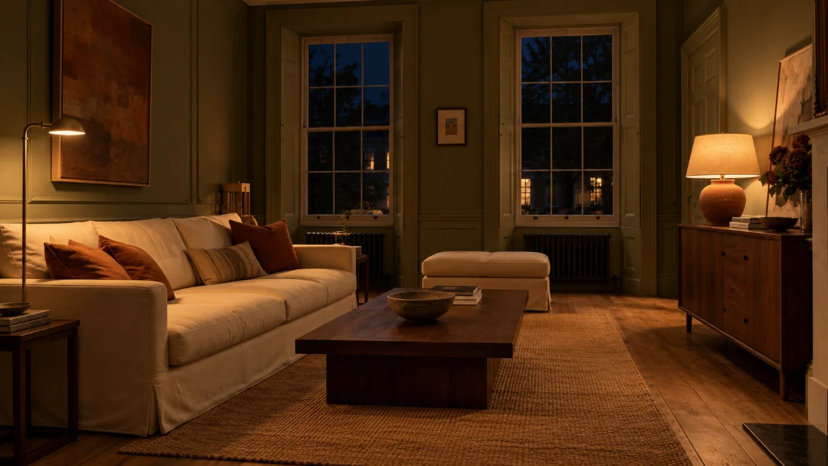
So choose for the hours you use the room. In an evening room, the lamps matter more than the window. Warm-white bulbs push walls toward yellow, and cool-white ones push them toward blue. Bulb color is covered in living room lighting ideas.
5. Warm Living Room Colors That Aren't Beige
Warmth isn't only yellow. Most warm living room colors that don't look beige share one quality. They're earthy and softened, with some brown or gray in them.
Olive and moss green. Olive gives you more color than beige while staying calm. It sits well with warm white, oak, walnut, cream, terracotta and a little charcoal. For walls, a grayed olive is easier to live with than a bright leaf green, which can look sharp across a large surface. Our olive-green living room ideas article cover olive walls, sofas and pairings.
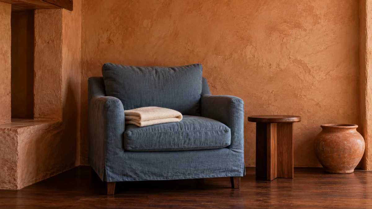
Terracotta and clay. These bring the most direct warmth. Terracotta is strong, so it often works best in smaller doses, like an armchair, curtains, a ceramic lamp or a painted alcove. If you want it on the walls, dusty or brown-leaning versions are calmer than ones that lean orange.
Muted blue. Blue doesn't automatically make a room cold. A dusty blue with gray or green in it, next to warm wood, cream, camel or rust, adds a cool counterpoint. It keeps an all-warm room from feeling heavy, and it's especially useful in sunny south- or west-facing rooms.
Mushroom, taupe and greige. These give the softness of a neutral without classic beige's yellow. The undertone decides everything here. A green-leaning greige looks fresh, and a pink-leaning taupe looks soft and slightly vintage.
Dusty pink and muted plum. In restrained, grayed versions, they warm a neutral room without looking sugary. Pair them with olive, brown, cream and a touch of charcoal.
Climate shifts the balance too. In hot, bright homes, a lighter wall with warm color kept to textiles is the easier route, since cushions and curtains can be swapped when the sun fades them. In cool, gray climates, deeper earthy walls are easier to live with, because the soft light tones them down.
6. An Earthy Living Room Color Palette: Three Schemes to Try
If you'd like a starting point to take to the paint store, pick one of these living room color ideas and adjust it to your floor and sofa.
Olive, cream and wood. Warm ivory walls, a muted olive sofa or feature wall, natural oak, terracotta accents and a little deep brown. It suits rooms that already have plenty of wood and want more color without getting busy.
Clay, warm white and dusty blue. Soft clay walls, warm white trim and ceiling, a dusty blue chair or curtains, walnut furniture and cream textiles. Clay is the strong color and the blue stays muted, so the room feels warm with a cooler edge, rather than all orange.
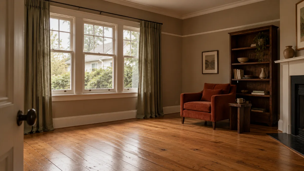
Mushroom, sage and rust. Mushroom walls, warm white trim, muted sage curtains, a rust armchair and dark brown wood. It's soft, layered and slightly vintage, for anyone who likes neutrals but wants more personality than all-beige.
Each scheme varies lightness as well as hue. There's a pale base, a mid-tone main color, one stronger accent and a dark grounding tone. A room where every color is equally strong can feel busy. A room where everything is equally pale can feel flat.
7. Turn the Saturation Down, Not the Color
Put bright green, bright orange and bright yellow side by side, then muted olive, dusty terracotta and ochre. Same family of hues, very different rooms. The first looks like a playroom. The second looks settled.
Colors can be clear (bright and clean), muted (softened with gray or brown) or deep (darker and heavier). In a relaxed living room, muted and deep versions layer more easily than several clear ones. That doesn't make the room dull. One stronger accent, like a single rust cushion or an ochre print, stands out more when everything around it is quieter.
As a quick check, photograph your samples, a fabric swatch and a cushion together, then switch the photo to black and white. If everything turns almost the same gray, there may not be enough contrast in lightness. If one item jumps out straight away, that's probably your strongest accent, so make sure it's the one you meant.
Texture helps muted colors too. The same olive looks richer in a nubby linen or a velvet than on a flat wall. The modern cozy living room guide covers mixing textures.
8. Test Paint Samples in the Room Before You Commit
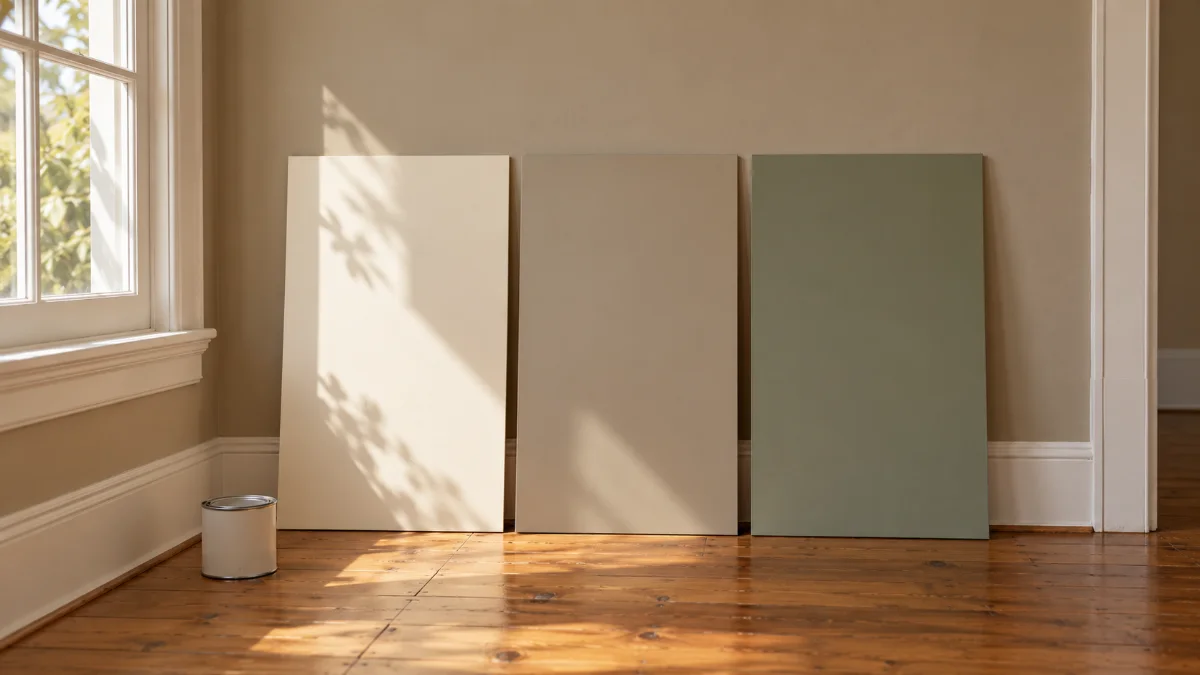
Narrow the list to three or four finalists, then test them in the room itself, at a decent size, over a few days. Paint makers say the same. Benjamin Moore suggests living with samples for a few days before you buy, because colors shift from morning to evening.
- Go big. Paint large sample boards rather than relying on a small chip. A tiny square can't show how a color behaves once it fills your view.
- Keep it off the old color. Paint onto white board, not straight onto the existing wall, which tints what you see.
- Move it around. Try each board by the main window, in the darkest corner, and next to the floor and sofa.
- Check three times of day. Morning, afternoon and evening under your usual lamps, especially at the hours you actually use the room.
- Look from where you sit. View the samples from the sofa and the doorway, not just up close.
The common mistake is judging only at noon on a sunny day. Many living rooms get most of their use in the evening, under lamps. That's when a warm white can turn peach or a gray-green can go muddy.
9. Choose the Paint Finish Separately From the Color
Color and sheen solve different problems. Sheen is how much light a painted surface reflects, so the same color in matte and satin can look quite different (Benjamin Moore).
| Finish | Look | In a living room |
|---|---|---|
| Flat | No shine | Hides wall flaws well, harder to clean |
| Matte | Soft, very low shine | Calm walls, hides small dents and patching |
| Eggshell | Slight sheen | Good balance of looks and wipeability |
| Satin | Noticeable sheen | Hard-wearing, but shows wall flaws more |
| Semi-gloss | Clearly shiny | Usually kept for trim, doors and baseboards |
For living room walls, matte and eggshell are the usual choices. Matte looks soft and forgiving. Eggshell wipes clean more easily, which helps with children, pets or a sofa pushed close to the wall. Light matters here as well. Benjamin Moore's UK site suggests that slightly more reflective finishes like eggshell suit rooms with soft, indirect light, while flatter finishes suit rooms with strong direct sun.
In humid homes, the paint system matters as much as the color. Make sure the wall is dry and sound first, since paint over damp plaster can blister and peel. Check the product's details on washability and mold resistance, not just the color card. "Low VOC" on the can is helpful but says nothing about durability, so look at both. While painting, keep windows open and fans running. The US EPA recommends plenty of fresh air when using products that release VOCs, paint included. Furniture and fabrics for damp rooms are covered in the guide to furniture for a humid climate.
Final Thoughts
A warm living room needs a few related colors that agree with your floor, your sofa and your light, and a little patience before the big cans come home.
Start here: tonight, photograph your living room with the lamps on. Then hold your favorite paint card against the floor and the sofa in that light. Do it again tomorrow at noon. Anything that still feels comfortable in both deserves a place on your shortlist.